

In last week’s column, I discussed my lack of design skills and how Lucas and I called in our talented friend, Jess, to help us choose aesthetically pleasing choices for our rental home. We talked mainly about exterior last week (take a look here!), so this week we’ll attack the interior.
I learned several things while working through the design of the inside of our rental:
1. Classic style choices in a rental are best, since this investment strategy is long-term and requires mass appeal.
We plan to have this rental property for a lot of years, so even though a bright-colored accent wall or trendy, patterned backsplash would be fun (and appeal to current-market renters), it won’t serve our purposes in the long run. We went with a classic color palette: Grey walls, white trim, chrome finishes.
NOTE: Not all greys are equal. Some are more blue, some are more green, some are more purple. It’s very weird and very confusing. We found this grey and this white to be about as close to the neutral versions as possible!This paint will be a fresh update to a previously tan inside with brown and gold accents (see images here!).
2. Design choices for rentals should account for what will wear well
Whether we like it or not, we keep getting told that our rental home won’t be pristine and perfect forever, so we need to design with future wear and tear in mind.
NOTE: Paint sheens are a thing. I had no idea. You don’t just pick whichever one you think sounds cool (or else we’d all be using Eggshell!). Each paint sheen serves a specific purpose and is best used in a different area of your home. You want cupboards and trim you can easily wipe down. You want walls in high traffic areas that can withstand the overuse. If you’ve got questions on this, here’s a great article that’ll summarize it for you and help you choose the right sheen for whatever you’re painting!
3. Don’t overspend!
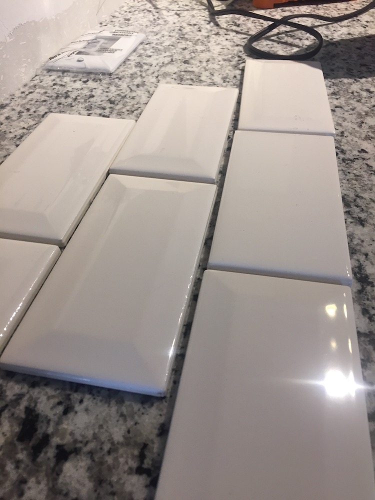 A few times Lucas and I fell into the trap of wanting to buy the highest end, prettiest version of everything. We’ve had to constantly remind ourselves that this rental is an investment and we don’t have to appeal to a buyer. Renters are much less picky than buyers. One area where this played out specifically was with our backsplash choices. We hemmed and hawed over a pretty stone tile or one with accents in it, until we saw the first episode of the new HGTV show, Flipping Texas, where the couple featured on the show had the very same conversation. Instead of landing on a regular subway tile, they decided on a beveled subway tile, which looks similar, but adds just a bit more interest. When we priced it out for ourselves, we found the beveled tile was only $20 more expensive overall. So, we went with it. We’re installing it this weekend! Stay tuned for how it turns out!
Stay up to date with this column so you can see the final product. Sign up here.


0 Comments